
Minimizing customer frustration with an “availability” calendar
During the redesign of Willow Valley’s online reservation interface it was pretty clear to us that one of the biggest roadblocks in getting customers the rooms and packages they wanted was telling them that what they wanted wasn’t available. The whole experience reminds me of how my three year old reacts when I tell him he can’t do something. If he feels like he has options, the waterworks are usually kept at a minimum. We looked at the whole online reservation experience the same way.
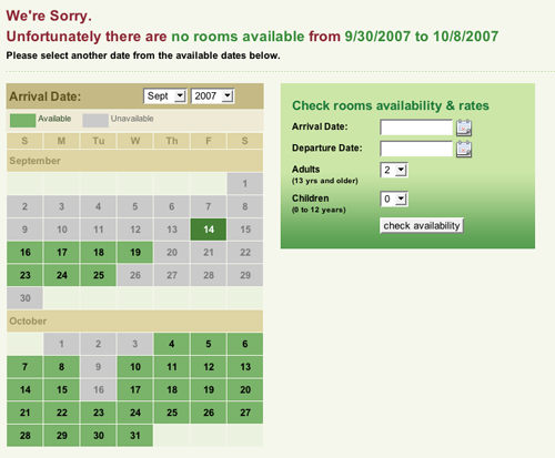
There you are, entering all your information about your stay (dates and guests) and instead of the site respecting all your hard work when it does not have an exact match, you experience the “SORRY…we have no results.” dead-end. Very frustrating.
We took some time to explore some best practices in reservation and calendar systems across the Web. We were quite surprised to see that the results were all over the board. We did come across a very small reservation system for cabin rentals in Tennessee that we felt started to address this problem. We took the idea and ran with it. The concept is pretty simple “if we don’t have exactly what you want, then we’ll show you something close to it.” So, we developed an “availability” calendar that would proactively indicate which days were available and which days where not. No more, no less. Enough to keep the frustration level down and the chance of making a reservation up.
In addition to the visual indicator, we opted to allow the customer multiple ways of entering available dates. This can be done by either 1.) click on the arrival date in the calendar; or 2.) manually entering the date in the arrival field. That seemed all well and good, but one thing just didn’t feel right to me. It was the whole idea that I wanted to “see” my entire stay to confirm, that “yes, this is what I want”. So Micah got to work on putting a nifty little script together that tracks when you click first (the arrival date) and click second (your departure date) and changes the colors on those dates to visually confirm this is what you requested. In the end I think we put together an interface that makes the user really feel like they have options and are in control. We will be keeping tabs on reservation numbers and overall conversion rates for Willow Valley with this new interface and will monitor its progress.
The bottom line is really quite simple: think of the person using the site and understand what motivates and frustrates them, then do what is needed to make the experience as positive as possible.