
A Look Ahead at Design Trends
New year, new look? Not exactly. We agree with Madeleine Morley of the American Institute of Graphic Arts when she says, “A trend never simply emerges for a single year and then disappears in a puff of smoke. Instead, an aesthetic becomes popular gradually, even mysteriously, over time before fizzling out slowly without much notice at all.”
Let’s take a look at the top five design evolutions I’ve noticed growing in popularity for the year ahead.
1. High Definition Images
Imagery plays a significant role in design whether it’s on a website, a billboard, or in a magazine. Even though this trend isn’t brand new, more and more companies are warming up to the importance of high-quality images for their websites. Ten years ago you would worry that a high-resolution image would bog down your website and bring load times to a screeching halt. Nowadays adding great imagery to your website has become a much easier task.
I’m not suggesting that every website should look like a photographer’s portfolio website. But, there’s a happy medium between showing off what you do and making a strong connection with your audience. Expect to see more companies set the tone of their website with large images, toss in some looped videos with no sound, and garnish with some web-responsive fonts and bon appetite.

2. Google’s Material Design Principles
In 2014 Google released their Material Design Principles, which is essentially Google’s very own design language or style guide. Many design enthusiasts refer to these principles as “Flat 2.0”. Through subtle shadows, gradients, transitions, and bold color, this semi-flat design style gives the appearance of depth and dimension.
Expect to see a more liberal use of simple grid-based layouts, responsive animations and transitions, white space, and depth effects such as lighting and shadows. These provide a minimalistic approach that will gain even more popularity and create a more purposeful brand experience in 2017.
3. Retro
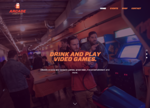
Nostalgia makes for some of the best inspiration. Many millenials agree! When I think retro I see bright bursts of color, crisp geometric shapes, and funky patterns. At Scheffey, we’re applying the duotone effect along with geometric shapes, and bright colors. An example of the duotone effect would be the main image of this blog, where we essentially use two bold colors to create our own version of black and white. This combination of light and dark tones combined with the right typeface gives you that retro feel but with a modern twist.
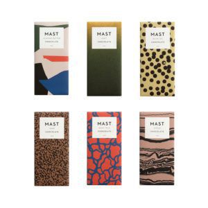
Another great example of retro design would be the package designs for Brooklyn-based Mast Chocolates. Each bar comes wrapped in its own interesting texture or pattern. Maybe it’s just me, but I feel a strong connection to the late 80’s and early 90’s. These designs take me to simpler times before the Internet was even really a “thing”. Combining these styles with the technology we have today allows us to express ourselves in an easy to understand way.
4. Modular Websites
Neat. Clean. Organized. The grid will be the primary organizing principle to keep elements aligned and equal. Think of grid layouts as a Tetris board, we’re working with a given amount of space and organizing that space into our own little puzzle. You could even compare the grid to a modern-day form of quilt weaving. (I’m sure your grandma will have tons of tips!)
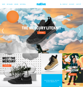
While print designers have always lived by the grid, more web designers are following suit. An awesome example is Native Shoes. Take a look at the way they divide information. It’s very digestible and everything has its own place. Instead of filling the web page with a long block of text they made the site their own collage of interactive imagery, which stacks beautifully when accessed on your mobile device.
5. Flat Icons
Designers often refer to simplistic icons without shading or beveling as flat icons. This essentially refers to easy to read symbols that use lines and geometric shapes to convey a message. They have very little detail and can often replace the use of words.
Flat icons have taken the lead by focusing on very clean, minimalist foundations. They are popping up in logos, mobile apps, websites and infographics for enhancing content.
Simple, Simple, Simple
If you’re sensing a theme here, it’s probably that simplicity is key. A cluttered design makes for a cluttered mind. The more clear and concise you can be with your messaging the better.
Will you take some of these simple elements for a test drive in 2017? While following trends just for the sake of being trendy is dangerous, if the growing movement fits your project, brand, and audience, it could be just the brand refresh you needed.